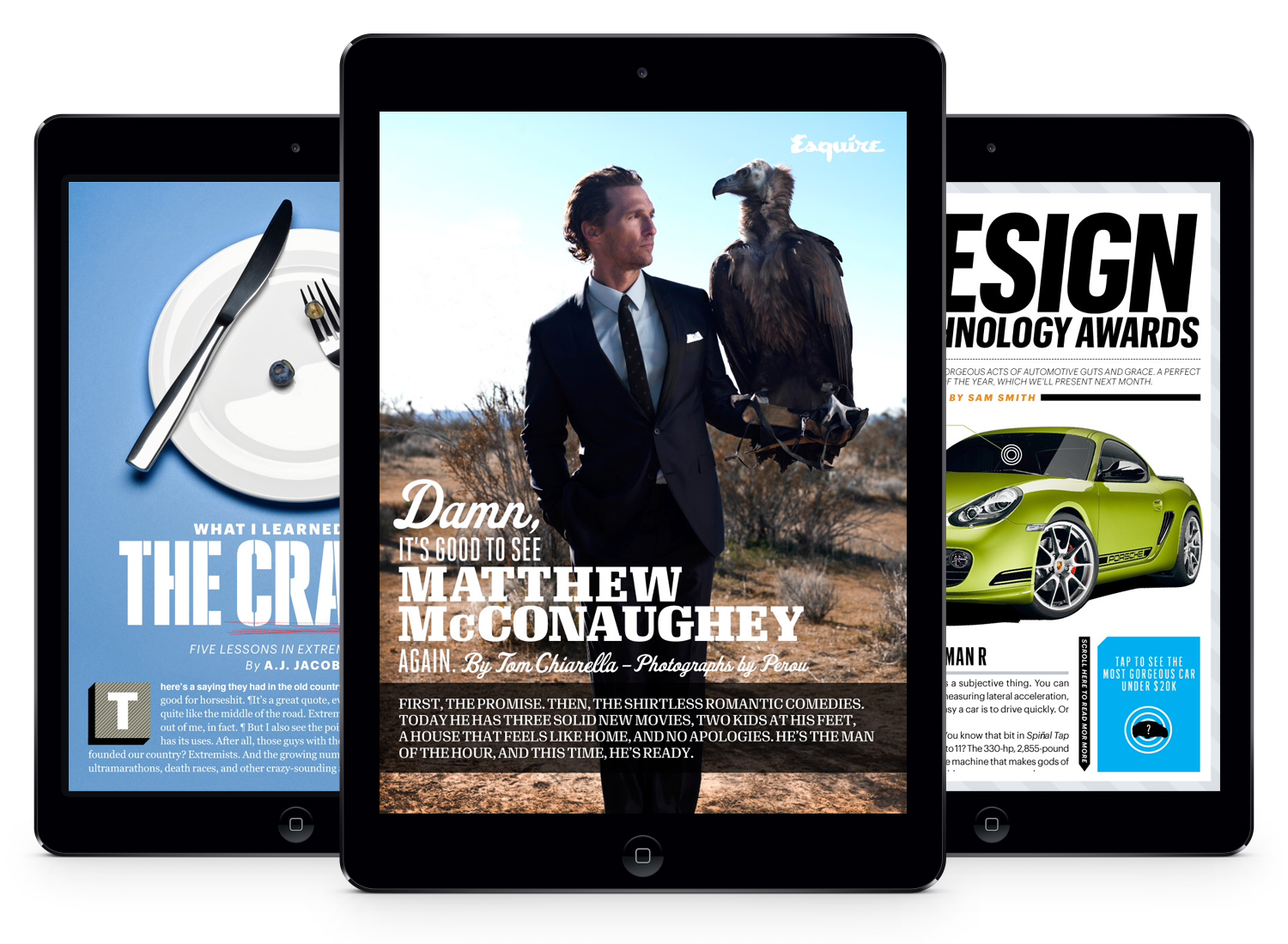
Esquire Magazine iPad App
I helped launch the first ever iPad edition of Esquire Magazine. Rather than simply digitizing a magazine, we took a step back to reconsider the digital medium and push the idea of what a monthly magazine can be. The result is an enhanced reader’s experience leveraging interactive and digital-exclusive features like interactive front of book content, 360 degree scrollable images, music integration, animations, videos and more.
The Challenge
Esquire tasked us with nothing short ofestablishing their legendary brand in the digital age. They wanted to make their readers excited about experiencing familiar content on a potentially unfamiliar medium. But more than just a seamless transition to digital, they envisioned new kinds of visual and interactive features that could tell stories in a more engaging and comprehensive ways than print. It called for an efficient content production process for releasing an iPad edition in conjunction with each monthly issue.
My Role
Concept Ideation: I brainstormed the original concepts and created the pitch collateral that ultimately won the business.
Experience Strategy: I found solutions to amplify the content and connect it with the interactivity of the platform (e.g. integrating audio into music-related articles, animating illustrations, 360 degree product views and real time quizzing).
Design Execution: I worked closely with Esquire’s in-house digital team to instruct them on designing assets for the iPad and best practices for producing a scalable digital product. With each issue, we identified new features and content solutions that became a library of tools for future implementation.
Leadership: I worked closely with the product and development teams as well as Esquire’s in-house digital team to produce the highest quality product and release new content and features on a monthly basis synchronized with the newsstand edition.


